Extended gene expression
In the following, we demonstrate SeQuaiA’s visualization features on a more complicated gene expression model [1,2], which is widely used for benchmarking of CRN analyzers. The model can be downloaded here.
The model specification
The reactions of the network can be seen below.

We consider r1 = r2 = 0.1.
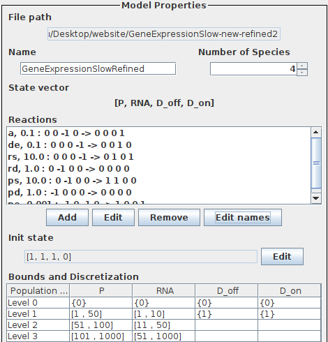
The specification of the extended gene expression in SeQuaiA can be seen below.
The abstraction
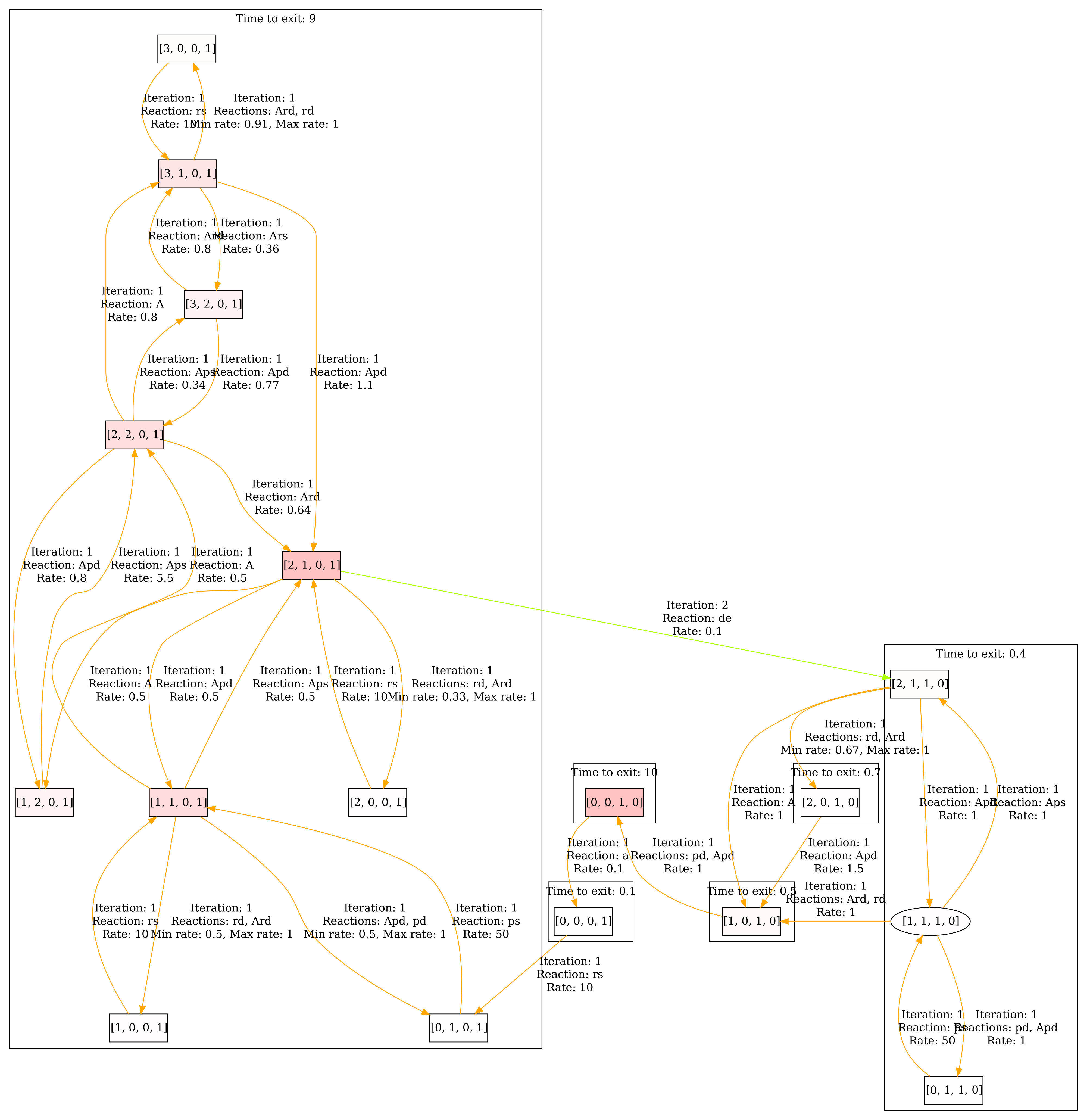
The abstraction of the of model can be seen below. The envelope is set to 5.
First step
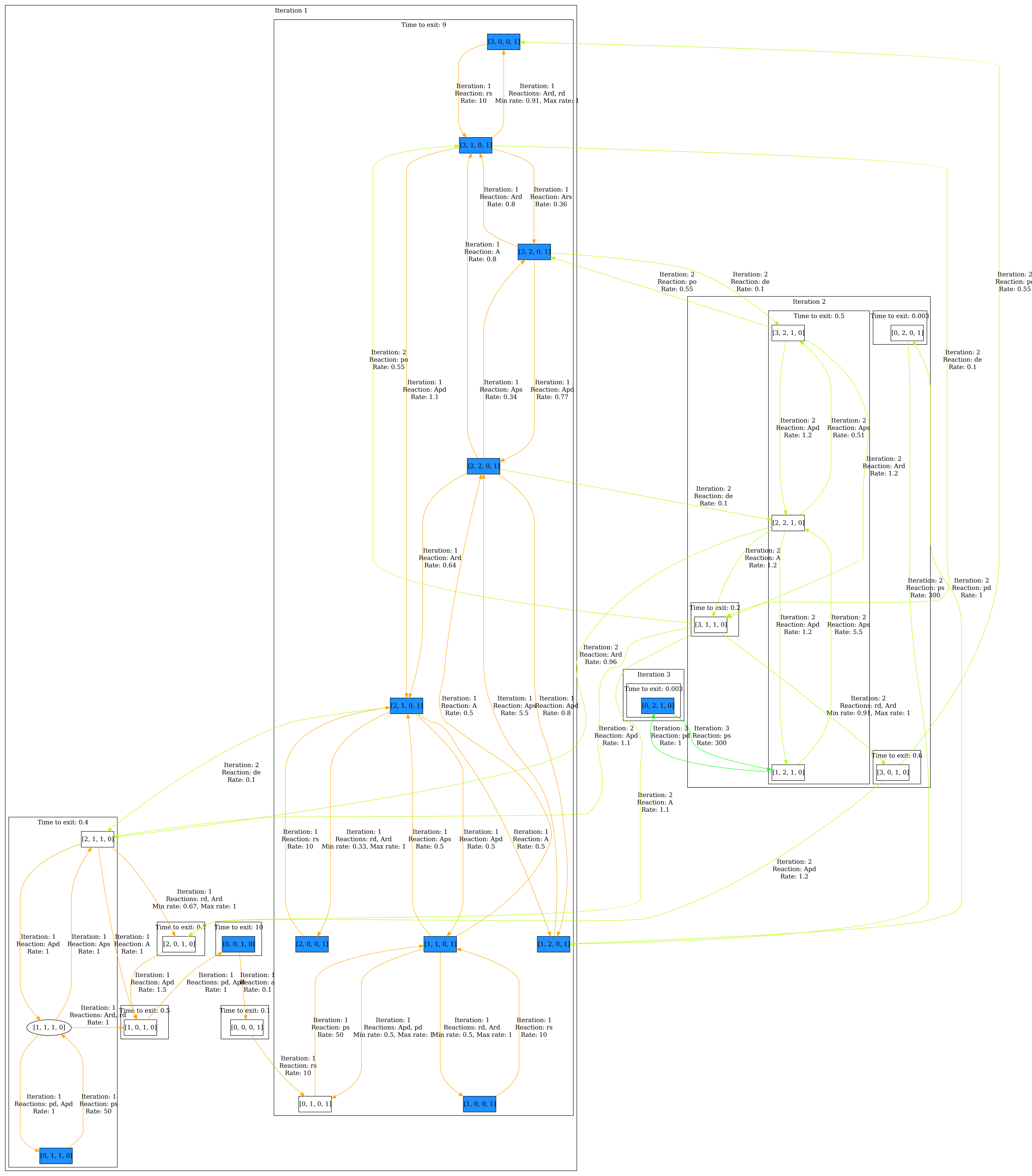
Now we want to visualize a correlation, i.e. given a list pairs, we want to colorize the states where the described correlation is satisfied. In the following, we want to colorize the states where we have population level 1 and 0, 0 and 1, 2 and 0 and 3 and 0 for P and D_off, respectively.
Once you have opened the model, make sure you have clicked Perform analysis in the Model properties panel. Go to the Visualization panel and select Colorize correlation in the Colorization section. Click Edit correlation 1, a dialog opens. Select P and D_off and enter the following pairs: (1,0),(0,1),(2,0),(3,0). Then close the dialog and click Visualize. The result can be seen below. We can see that there is indeed a correlation between high amounts of proteins and DNA being on.
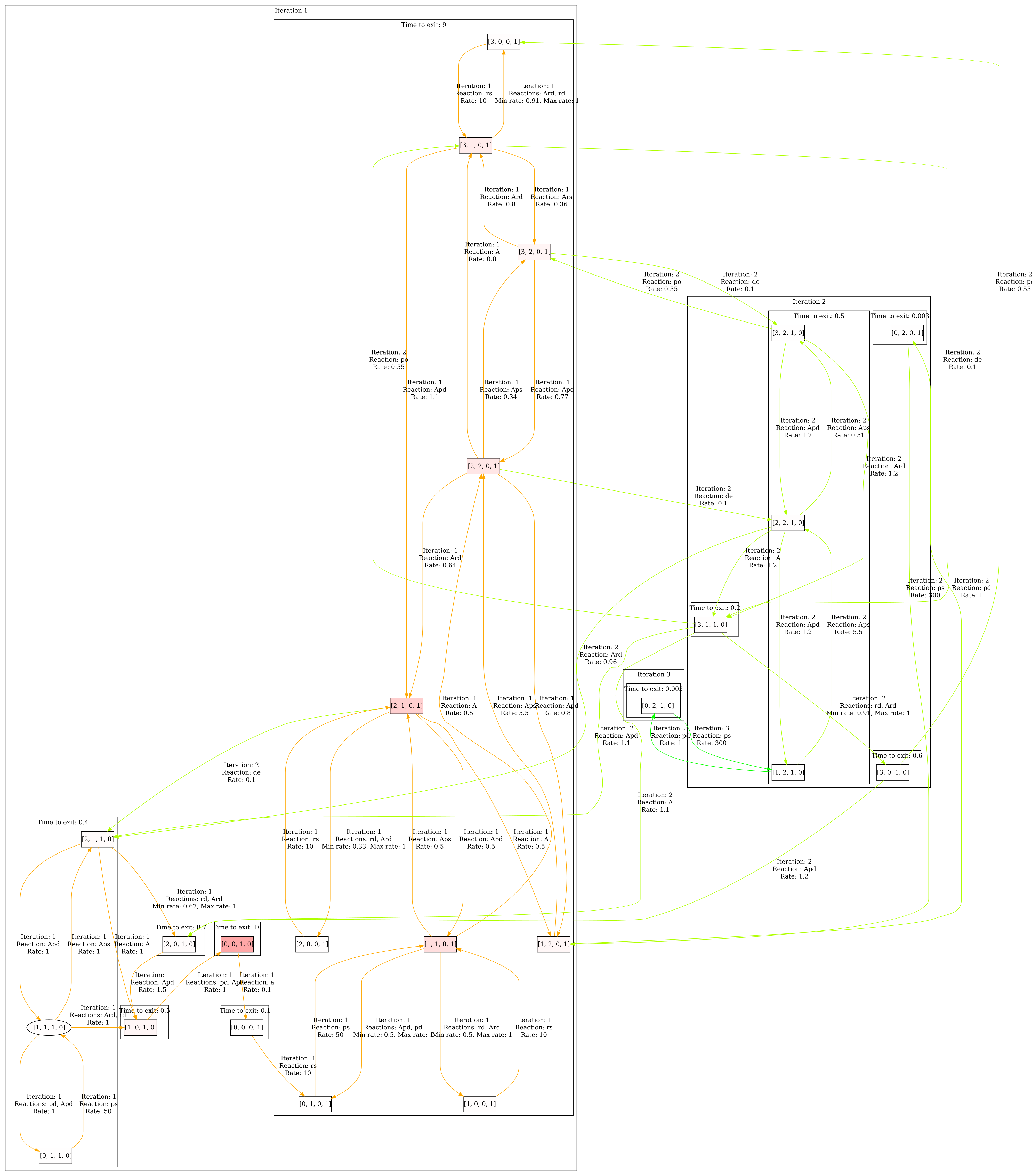
Now we can also visualize the steady state of the system by selecting Colorize steady state in the Colorization section. Then click Visualize. The result can be seen below.
Second step
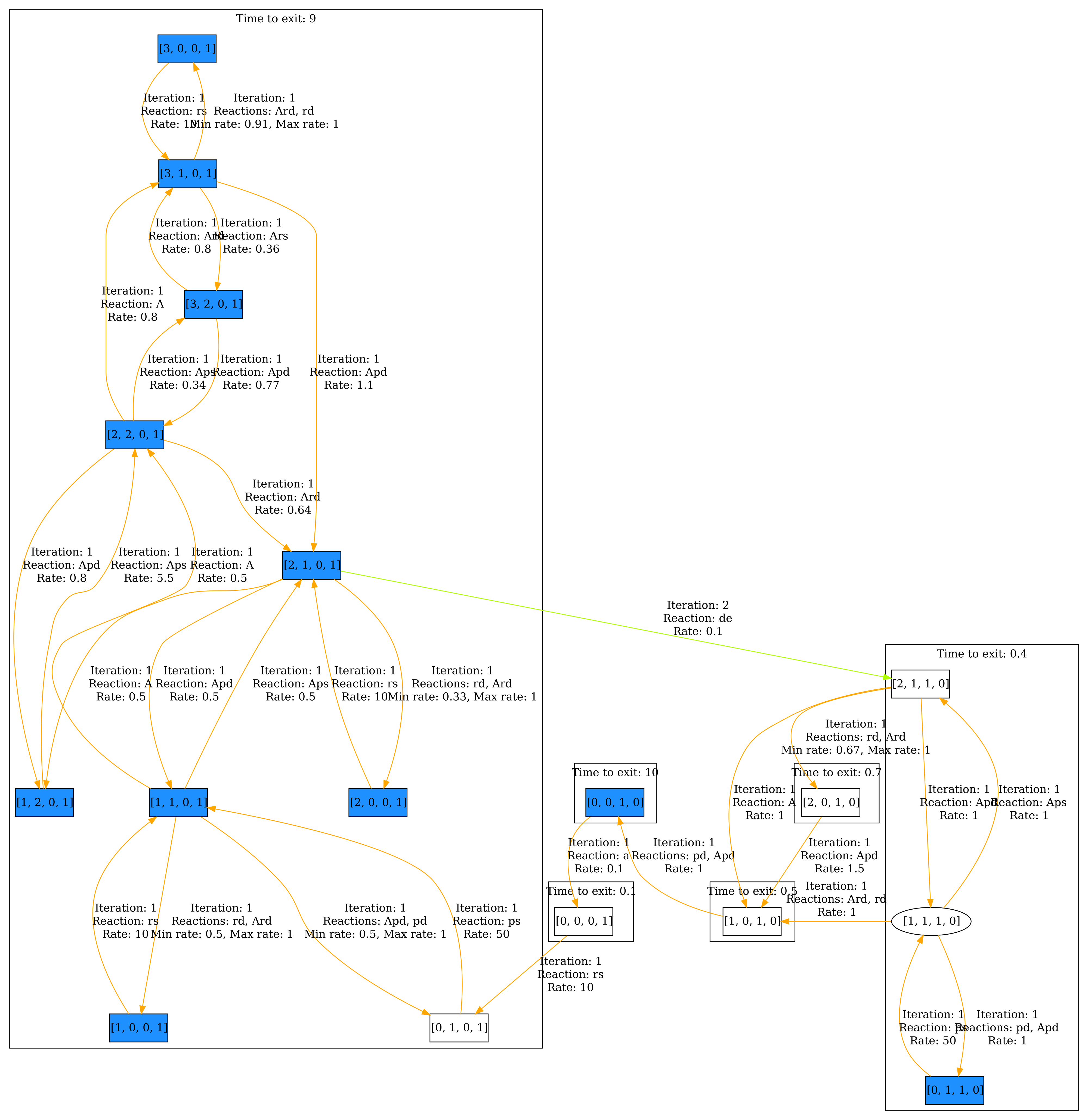
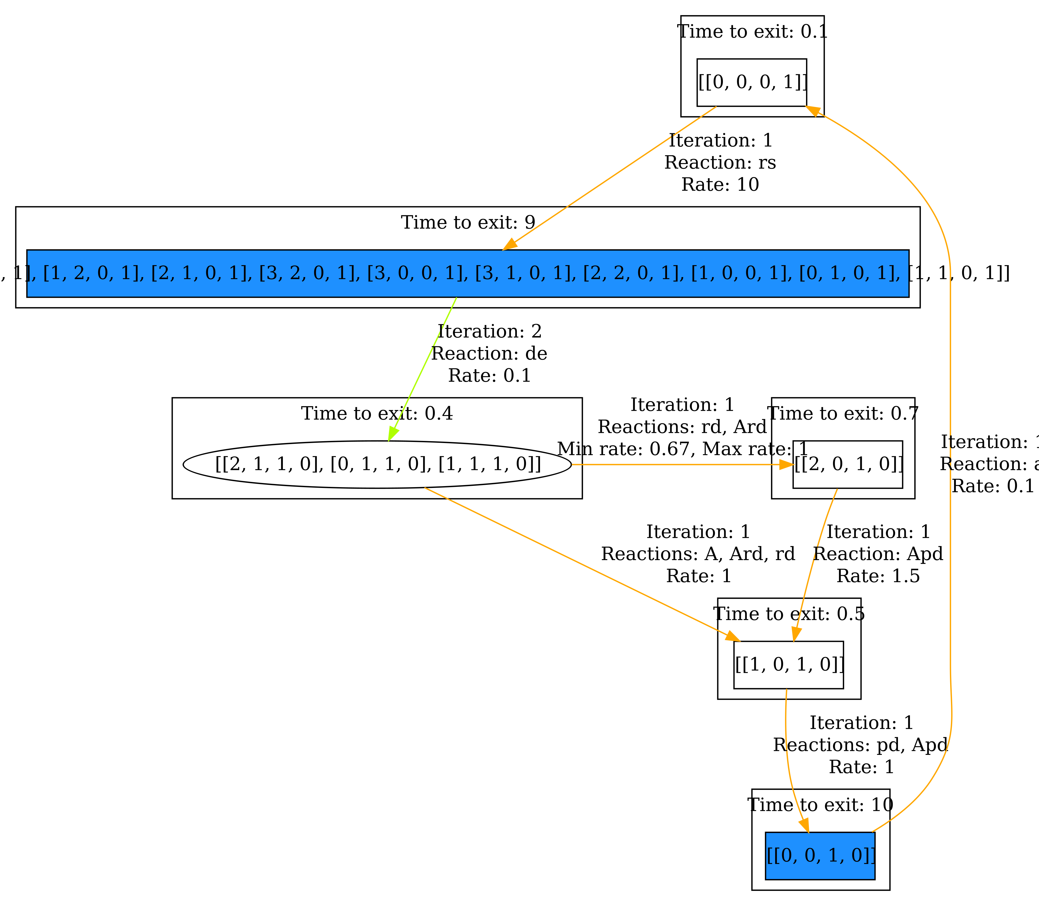
Now we can further adjust the visualization. In the Grouping section, select Group by iteration SCCs, grouping the states according the SCC they belong to within the iteration they are discovered. Because the interesting states (colored in blue) are discovered within iteration 1, we set Minimum iteration to 0 and Maximum iteration to 1. Now only states discovered within the first iteration are displayed. Then click Visualize. The result can be seen below.
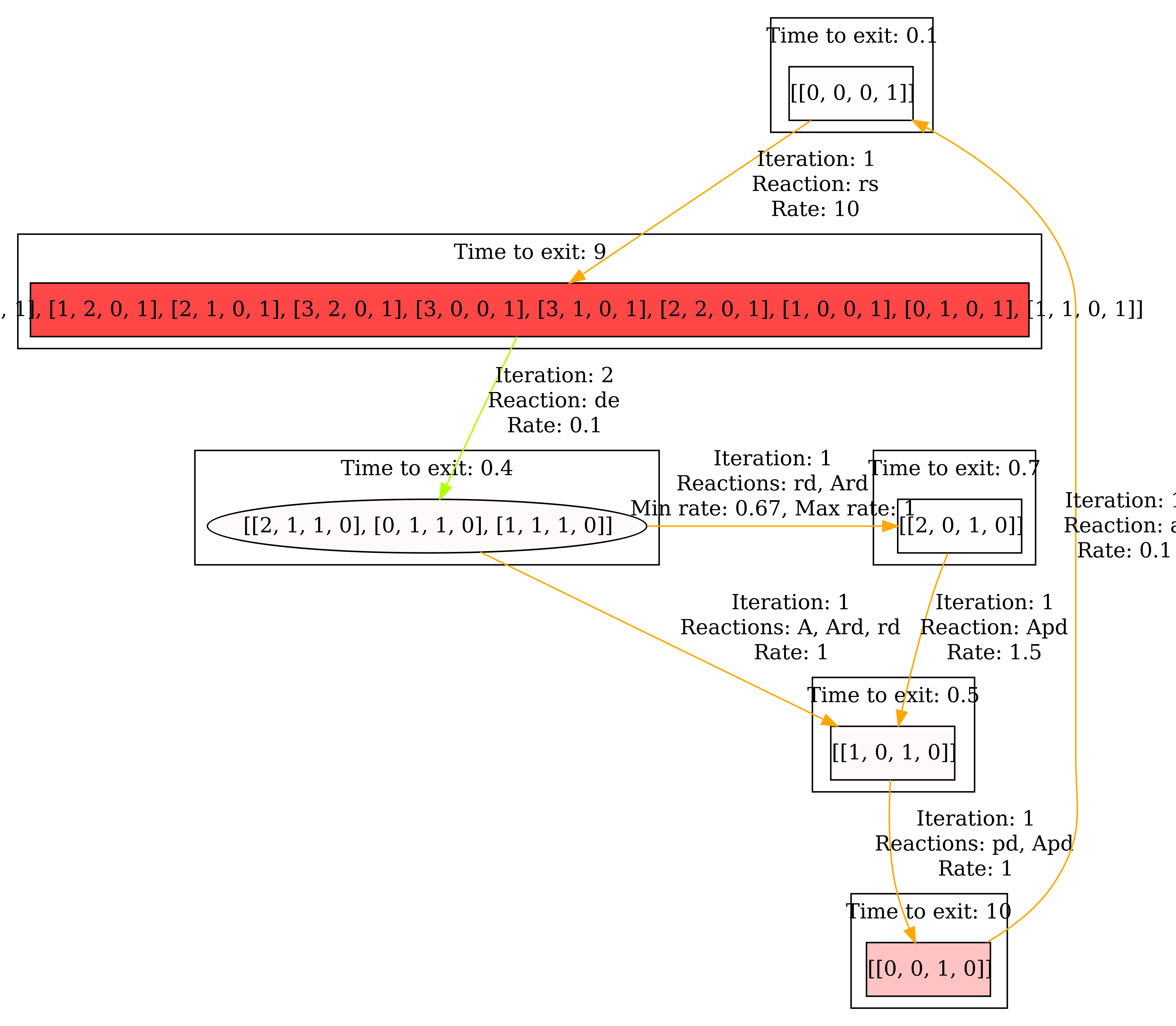
As before, we can also have a look at the steady state. The result can be seen below.
Third step
Finally, we want to change the View to have a more compact visualization. Select Collapsed aggregates in the View section. All the states that are grouped together, now form a single state. Then click Visualize. The result can be seen below.
And again, we also have a look at the steady state. the result can be seen below.
Now it becomes clear that we spend most of the time in the correlated states. In general, the Collapsed aggregate view is useful for ignoring uninteresting behavior within the components.
Conclusion
We have demonstrated that the workflow for visualizing quantitative information is useful. Particularly, we have shown that the system spends most of the time in the correlated states.
Sources
[1] Golding, I., Paulsson, J., Zawilski, S.M., Cox, E.C.: Real-time kinetics of gene activity in individual bacteria. Cell 123(6), 1025–1036 (2005)
[2] Hasenauer, J., Wolf, V., Kazeroonian, A., Theis, F.: Method of conditional moments (MCM) for the chemical master equation. Journal of Mathematical Biology pp. 1–49 (2013). https://doi.org/10.1007/s00285-013-0711-5